A visitor lands on your homepage, glances around for three or four seconds, and decides, almost entirely on gut feel, whether your business is worth their time. Logo and color palette barely factor into that call. What actually decides it is website user experience: how easily someone understands what you do, finds what they need, and takes the next step without friction.
Plenty of businesses still treat website user experience (UX) as a design line item, something to “polish” once development wraps up. That’s backwards. UX decides whether your traffic turns into pipeline and whether your marketing spend actually pays off. A beautifully designed site with confusing navigation loses to a plainer one that respects the visitor’s time.
This guide breaks down what website user experience actually means, why it now sits at the center of web design for customer engagement, and how to diagnose, fix, and measure it, with current benchmarks, real cost ranges, and a framework you can apply this quarter.
Here’s What You’ll Walk Away With:
- A working definition of website UX, and how it differs from UI and customer engagement.
- The CLEAR framework for auditing any website in under an hour.
- 2026 benchmarks for bounce rate, load speed, and mobile behavior.
- Website layout and navigation patterns that actually reduce friction.
- Design ideas and inspiration worth borrowing in 2026 and a few worth skipping.
- Real cost and timeline ranges for a UX-focused redesign.
- A decision framework for choosing between a quick fix, a UX audit, or a full redesign.
What Is Website User Experience, Really?
Website user experience is the sum of every interaction a visitor has with your site: how quickly it loads, how easily they orient themselves, whether the layout matches how they naturally scan a page, and whether the site earns enough trust for them to act. It’s broader than visual design and narrower than “everything about your brand online.”
Practitioners typically break UX into five overlapping qualities: usability (can people complete tasks), findability (can they locate what they need), accessibility (can people with disabilities use it), credibility (do they trust it), and desirability (do they enjoy it). Miss any one, and the whole experience suffers. A gorgeous site that loads slowly fails on usability. A fast, accessible site with no visual hierarchy fails on desirability.
It Also Helps To Separate Three Terms People Use Interchangeably:
- UI (user interface) is the visual layer: buttons, color, typography, icons.
- UX (user experience) is the full journey: how UI, content, layout, and performance combine to help someone reach a goal.
- Customer engagement is the outcome of good UX: the clicks, time on site, return visits, and conversions that happen once the experience works.
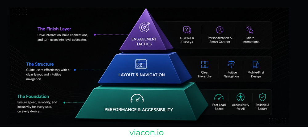
That distinction matters, because so much web design for customer engagement advice jumps straight to tactics: add a quiz, add gamification, add a chatbot, without ever fixing the UX those tactics sit on top of. Interactive elements only pay off once the underlying experience is already fast, clear, and easy to navigate. Bolt engagement tactics onto a confusing site and all you’ve done is make the confusion louder. It’s also why our own web and app development engagements start with UX and information architecture before a single interactive element gets built.
Why Website User Experience Is A Business Metric, Not A Design Preference?
Design teams have argued the UX ROI case for years, but the numbers are now hard to ignore. Forrester’s widely cited (if now-vintage) research put the return on UX investment at roughly $100 for every $1 spent a figure still referenced across the industry because no one has produced a more current benchmark study at that scale. Treat it as directional rather than gospel, and verify against your own conversion data before quoting it in a boardroom.
More recent and narrower data points tell a consistent story. Think with Google research found that well-designed interfaces can see conversion rates north of 200%, while 88% of online shoppers say they’re less likely to return to a site after a poor experience. On performance specifically, industry benchmarking shows that a one-second delay in load time can cut conversions by roughly 4.4%, and close to half of visitors abandon a page that takes longer than four seconds to load.
The mobile picture raises the stakes further. Mobile devices now account for roughly 60–64% of global web traffic, and mobile sessions bounce at meaningfully higher rates than desktop a gap that hasn’t closed despite years of “mobile-first” messaging. If your website user experience breaks down on a phone, you’re losing the majority of your visitors before they even see your offer.
| Cost of poor UX | Business impact |
| Slow load times | ~4.4% conversion drop per extra second; near-50% abandonment past 4 seconds |
| Confusing navigation | Higher bounce rate, wasted ad spend, lower pages-per-session |
| Poor mobile experience | Loss of 60%+ of total traffic potential |
| No accessibility support | Legal exposure (see the Risks section below) plus excluded customers |
| Weak first impression | Fewer return visits, weaker brand trust |
Bottom line: website UX now sits directly on your conversion rate, your customer acquisition cost, and your brand’s credibility. Defer it, and you’re paying to send traffic toward an experience built to lose them.
Web Design For Customer Engagement: How UX Turns Visitors Into Customers?
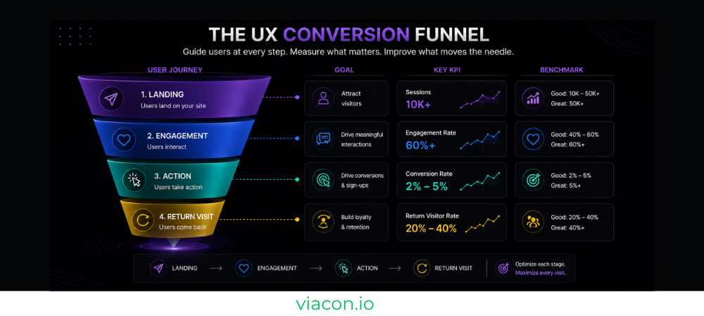
Web design for customer engagement really means translating good UX into behavior you can measure: clicks, scroll depth, time on page, return visits, form completions. Strip away the buzzword, and engagement is just the byproduct of removing friction at every step of the visit.
Three UX decisions Tend To Move Engagement More Than Anything Else:
- A Homepage That Shows Value In Seconds, Not Paragraphs: Fintech and SaaS sites that let visitors interact with a calculator, demo, or product preview above the fold consistently keep people on the page longer than sites that rely on a wall of marketing copy.
- Navigation That Answers “Where Am I, And Where Can I Go?” Instantly: Visitors who can’t orient themselves within a couple of seconds don’t explore; they leave.
- Micro-interactions That Give Feedback: Buttons that respond to hover, forms that validate as you type, and progress indicators on multi-step checkouts all signal that the site is listening, which keeps people engaged longer.
Personalization is the newer layer on top of this. Showing a returning visitor their recently viewed items, or adjusting a homepage’s calls-to-action based on referral source, can lift engagement. But only once the baseline experience (speed, clarity, navigation) already works. Personalization on a slow, confusing site just personalizes the frustration.
If your goal is squeezing more conversions out of the traffic you already have, this is also where conversion rate optimization and UX overlap almost completely. CRO is UX with a stopwatch and a spreadsheet, testing which experience actually gets more people to act.
The CLEAR Framework: A 5-Part Model For Auditing Website UX
A lot of website UX advice reads like a scattered checklist: fix your buttons, add whitespace, “be more accessible.” To make it actionable, we use a simple internal framework at Viacon when auditing a site: five pillars we call CLEAR.
- C — Clarity of value proposition
- L — Layout and visual hierarchy
- E — Easy navigation
- A — Accessibility and performance
- R — Reinforced trust and engagement
Run any page through these five checkpoints, and you’ll surface most of what’s holding back conversions.
C – Clarity: Does A Stranger Understand You In 5 Seconds?
Cover a new visitor’s screen and ask them what the business does, who it’s for, and what to do next. If they hesitate, your messaging hierarchy needs work before anything else changes. Clear, benefit-led headlines beat clever ones almost every time in usability testing.
Quick Checklist:
- Headline states the outcome, not just the product category.
- Subheadline answers “for whom” or “how”.
- One primary call-to-action is visually dominant per page.
L – Layout: Website Layout As The Structural Foundation
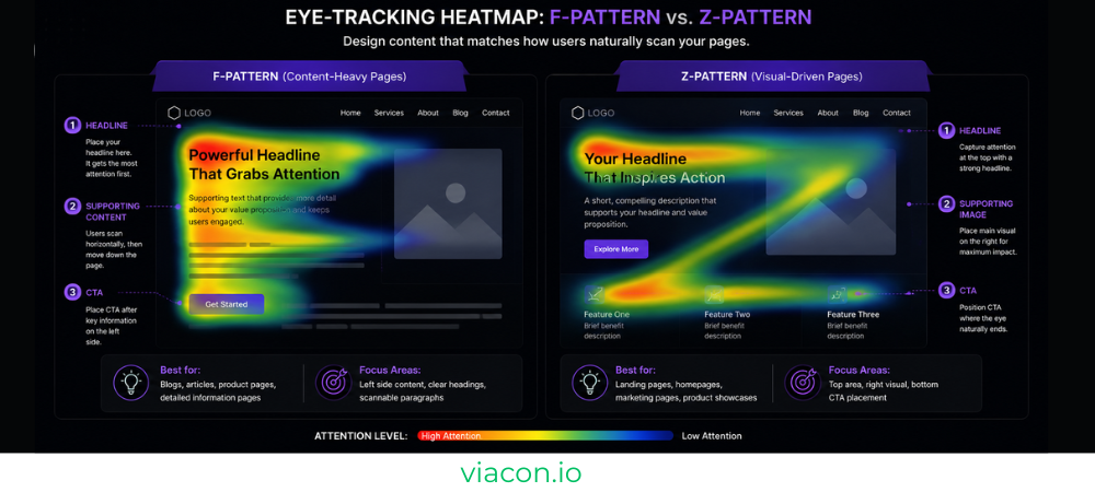
Website layout is how you organize information in space, and space is not neutral. Eye-tracking research consistently shows users scan pages in F-patterns (text-heavy pages) or Z-patterns (simpler landing pages), reading the top line, then a shorter second line, then scanning down the left edge. Design that ignores this pattern buries important content in dead zones.
Practical layout Rules That Hold Up Across Industries:
- Put your strongest message and primary CTA in the top-left to top-center zone, where the eye lands first.
- Use whitespace deliberately: it does real work, guiding the eye and giving key elements room to breathe.
- Keep a consistent grid (12-column is the web standard) so elements align predictably as users scroll.
- Design mobile layouts first, then scale up. Retrofitting a desktop grid onto a small screen is where most layout bugs originate.
E – Easy Navigation: Website Navigation People Don’t Have To Think About
Website navigation is the single biggest driver of whether visitors explore your site or leave from the first page. The goal is simple to state and hard to execute: every important page should be reachable in three clicks or fewer, and labels should describe content in plain language rather than internal jargon (“Solutions,” “What We Do”) that means nothing to a first-time visitor.
| Navigation Type | Best For | Avoid When |
| Top horizontal menu | Sites with 5–7 core pages, most B2B and SaaS sites | You have 12+ top-level categories (use a mega menu instead) |
| Mega menu | Large ecommerce catalogs, multi-service enterprises | Your catalog is small; it adds unnecessary complexity |
| Sidebar navigation | Documentation, dashboards, content-heavy hubs | Marketing-first pages where sidebar competes with the CTA |
| Hamburger menu (mobile) | Any mobile viewport | Desktop, when you have the screen space to show links directly |
| Breadcrumbs | Ecommerce categories, multi-level content | Single-page sites or shallow site structures |
Three non-negotiables here: keep navigation placement and styling identical across every page, make the logo click back to the homepage, and never let an open mega menu swallow the entire screen. Do that last one and users lose their sense of place almost instantly. Mobile tap targets should run at least 44–48 pixels, spaced apart to avoid accidental taps.
A – Accessibility And Performance: The Multiplier You Can’t See
Accessibility and speed are grouped together deliberately, because both quietly cap the ceiling of every other UX improvement you make. A beautifully laid-out page that takes six seconds to load, or that a screen reader can’t parse, never gets evaluated on its design merits; visitors are already gone.
Google’s own Core Web Vitals thresholds define “good” performance in concrete terms: Largest Contentful Paint (main content visible) under 2.5 seconds, Interaction to Next Paint (responsiveness) under 200 milliseconds, and Cumulative Layout Shift (visual stability) under 0.1 measured at the 75th percentile of real visitors, not your dev laptop. These are part of Google’s official page experience signals.
On accessibility, the WebAIM Million report (an annual scan of the top one million homepages) has repeatedly found that the vast majority of sites fail basic WCAG checks: missing alt text, poor color contrast, unlabeled form fields. That gap carries legal exposure as well as a usability cost, and it’s covered in more detail in the Risks section below.
R – Reinforced Trust And Engagement
The final pillar covers everything that convinces a visitor the site (and the business behind it) is legitimate enough to act on. Testimonials, case studies, security badges, real photography over stock imagery, and visible contact information all do this work. So do the interactive touches that make a static page feel alive: hover states, live chat, progress indicators, and content that adapts to returning visitors.
Quick Checklist:
- Social proof (reviews, logos, case studies) appears above the fold or one scroll down.
- Contact information and support options are never more than one click away.
- Forms show real-time validation instead of failing silently on submit.
Trend-chasing is how good UX quietly erodes. A new visual style shows up every year, and each one needs to run through the CLEAR framework before it lands on your site. If you’re hunting for website design inspiration this year, use the list below as a filter, not a shopping list: here’s what 2026’s most-discussed design ideas actually deliver, and where they tend to backfire.
| 2026 Trend | Good Fit For | Watch Out For |
| Bold minimalism / “complex minimalism” | B2B, SaaS, professional services | Can feel cold without strong photography or brand voice |
| Dopamine color palettes (bright, saturated) | Lifestyle, beauty, youth-focused, D2C brands | Poor contrast ratios if not accessibility-checked |
| Dark mode as a default toggle | SaaS dashboards, dev tools, content platforms | Extra QA overhead; must maintain contrast in both modes |
| Bento-box / modular grid layouts | Product pages, feature comparisons, portfolios | Can overwhelm on mobile if not simplified |
| Micro-interactions and scroll-based motion | Any site wanting a premium feel | Must respect prefers-reduced-motion; adds dev time |
| AI-driven personalization | Ecommerce, SaaS with logged-in states | Requires a solid data foundation; useless on a slow site |
| Glassmorphism (frosted-glass UI panels) | Premium, tech-forward brands | Can hurt performance and legibility if overused |
| Thumb-driven mobile navigation (bottom nav bars) | Content and commerce apps with heavy mobile use | Awkward on desktop; needs a separate pattern there |
Decision Criteria Before Adopting Any Trend: Does it fit your brand’s actual personality (not just what looks current), does it hurt your Core Web Vitals, does it pass a basic contrast/accessibility check, and can your team maintain it after launch? If a trend fails two or more of those checks, skip it. Inspiration is supposed to serve the experience, and plenty of “on-trend” sites have that backwards.
Measuring Website UX: Benchmarks, KPIs & Tools
One of the most common mistakes we see: teams still benchmarking against outdated numbers. Bounce rate, in particular, changed meaning when most sites moved to GA4. A “bounce” is no longer any single-page visit; it now excludes sessions that last 10+ seconds or include a conversion event, which makes the old “keep it under 40%” rule too strict for 2026.
| Metric | What It Measures | 2026 Benchmark (GA4-era) |
| Bounce rate — ecommerce | Single-page, disengaged sessions | 20–45% |
| Bounce rate — SaaS / B2B | Single-page, disengaged sessions | 30–55% |
| Bounce rate — blogs/content | Single-page, disengaged sessions | 70–90% (often healthy, not a red flag) |
| Cross-industry median bounce rate | All site types blended | ~44–47% |
| LCP (load speed) | Time to show main content | Under 2.5 seconds |
| INP (responsiveness) | Delay after user interaction | Under 200 milliseconds |
| CLS (visual stability) | Unexpected layout shift | Under 0.1 |
| Interaction rate | Clicks, downloads, sign-ups, form fills | Rising trend, benchmarked against your own baseline |
| Average session duration | Time spent per visit | Compare against page purpose, not a universal target |
Google has never confirmed bounce rate as a direct ranking factor, but it correlates strongly with the engagement signals that do. Treat it as a diagnostic, not a verdict.
Tools Worth Having In Your Stack:
- Google Analytics 4 for session, engagement, and conversion tracking.
- PageSpeed Insights / Google Search Console for Core Web Vitals field data.
- Hotjar or Microsoft Clarity for heatmaps and session recordings: where do people hesitate, rage-click, or abandon?
- WAVE Or Axe DevTools for automated accessibility checks.
- A/B Testing Tools (Google Optimize alternatives, VWO, Optimizely) once you have enough traffic to reach statistical significance.
Common Mistakes That Quietly Kill Website UX
The most damaging UX problems are rarely dramatic. They’re small, easy-to-miss decisions that quietly compound.
| Mistake | Why it hurts | Quick fix |
| Generic navigation labels (“Solutions,” “Resources”) | Users can’t predict what’s behind the click | Use plain, descriptive labels tied to real search terms |
| Auto-playing carousels on the homepage | Banner blindness sets in fast; only the first slide gets seen | Replace with a single, strong hero message |
| Forms with too many fields | Every extra field lowers completion rate | Limit to 3–4 fields for top-of-funnel forms |
| Pop-ups within the first few seconds | Interrupts before value is established | Delay pop-ups until scroll depth or exit intent |
| Inconsistent CTA styling across pages | Confuses pattern recognition, weakens trust | One consistent primary CTA style sitewide |
| Ignoring mobile tap target size | Causes mis-taps and frustration on phones | Minimum 44×44px targets, spaced apart |
| Skipping alt text and form labels | Excludes screen reader users, raises legal risk | Build accessibility checks into the QA step, not an afterthought |
Cost & Timeline: What A UX-Focused Website Project Actually Takes
Budgets for website UX work vary enormously because “improve my website’s UX” can mean anything from a two-week navigation fix to a full custom web development rebuild. Here’s a realistic 2026 range, based on current industry pricing data across small, mid-market, and enterprise projects.
| Project type | Typical cost (USD) | Typical timeline |
| Targeted UX fixes (navigation, forms, CTAs) | $1,500 – $8,000 | 2–4 weeks |
| Full UX audit + recommendations | $2,000 – $10,000 | 2–3 weeks |
| Small business redesign (5–15 pages) | $5,000 – $30,000 | 4–8 weeks |
| Mid-market redesign (20–75 pages) | $15,000 – $75,000 | 8–16 weeks |
| Ecommerce or enterprise rebuild | $75,000+ | 3–6+ months |
Several cost drivers show up in nearly every project, regardless of size: number of unique page templates, custom functionality (calculators, portals, integrations), content creation and copywriting, accessibility compliance level, and how many stakeholders have to sign off. Get five decision-makers into an approval chain, and you’ll routinely double the timeline you’d get with a single approver.
Plan For This Risk Specifically: a poorly planned redesign can tank existing SEO rankings if URLs change without proper redirects. If your current site (like this one) already ranks well for certain terms, the safer move is often to preserve the URL and improve the content and UX underneath it, rather than relaunching on a new address.
Risks & Limitations To Plan For
No UX initiative is risk-free, and being upfront about the limitations is part of doing this work responsibly.
- Accessibility Is Now A Legal Risk, Not Just A Best Practice: Federal ADA website accessibility lawsuits topped 3,100 in 2025 (a 27% increase year-over-year), and total digital accessibility litigation, including state courts, exceeded 5,000 filings, according to legal tracking firms including Seyfarth Shaw and UsableNet. Ecommerce accounted for the large majority of cases. Accessibility widgets alone haven’t protected businesses from being sued; genuine code-level fixes are what hold up.
- Redesigns Can Hurt SEO If Migration Is Mishandled: Changed URLs without redirects, removed high-performing pages, and heavy client-side JavaScript that blocks crawlers are the most common causes of post-launch traffic drops.
- Trend Adoption Has A Maintenance Cost: Motion-heavy or highly custom visual trends require ongoing QA across browsers and devices. Budget for that upkeep, not just the initial build.
- Personalization Requires Clean Data: Without reliable behavioral or CRM data, “AI personalization” tends to feel random rather than helpful, which can erode trust instead of building it.
- UX Improvements Take Time To Show In Analytics. Expect a 30–90 day lag between a UX change and a statistically meaningful shift in conversion data, especially on lower-traffic sites.
Decision Framework: Quick Fix, UX Audit, Or Full Redesign?
Not every UX problem needs a rebuild. Use this decision path before committing budget:
- Is The Core Issue Isolated To 1–2 Specific Pages Or Flows (a confusing checkout, a weak pricing page)? → Targeted fix. Cheapest, fastest, lowest risk.
- Do Metrics Look Off, But You’re Not Sure Why (rising bounce rate, falling conversions, no clear cause)? → UX audit first. Diagnose before you spend on a rebuild you may not need.
- Is The Platform Itself Outdated, Slow, Or Unable To Support New Features (no mobile responsiveness, unsupported CMS, structural accessibility failures)? → Full redesign. Patching an outdated foundation usually costs more long-term than rebuilding it.
- Are You Rebranding Or Entering A New Market where the current site no longer reflects the business? → Full redesign, planned alongside brand and content strategy, not as an afterthought.
| Path | Best For | Typical cost | Typical timeline | Risk level |
| Targeted fixes | Isolated, well-diagnosed problems | $1,500 – $8,000 | 2–4 weeks | Low |
| UX audit | Unclear cause behind declining metrics | $2,000 – $10,000 | 2–3 weeks | Low |
| Full redesign | Outdated platform, rebrand, structural issues | $5,000 – $75,000+ | 4 weeks – 6+ months | Medium (manage SEO migration carefully) |
Your 90-Day Website UX Improvement Roadmap
A structured rollout beats a scattershot list of fixes. Here’s a phased plan that works for most small-to-mid-size sites.
| Phase | Timeframe | Focus | Owner |
| 1. Diagnose | Days 1–15 | Run a UX audit: analytics review, heatmaps, Core Web Vitals check, accessibility scan | UX lead/agency |
| 2. Quick wins | Days 16–30 | Fix navigation labels, form friction, broken mobile layouts, glaring CWV issues | Dev + design team |
| 3. Structural work | Days 31–60 | Rework layout hierarchy, simplify navigation architecture, address accessibility gaps | Design + dev team |
| 4. Engagement layer | Days 61–75 | Add trust signals, interactive elements, and any personalization the data supports | Marketing + dev team |
| 5. Test & measure | Days 76–90 | A/B test key pages, compare KPIs against baseline, document what moved the needle | Analytics / growth lead |
KPIs To Track Throughout: bounce rate by page type, interaction rate, average session duration, Core Web Vitals scores, and conversion rate on your top three landing pages. Reassess every 90 days; website UX isn’t a one-time project, it’s a maintained asset.
Why Businesses Choose Viacon For Website UX & Web Design?
Plenty of agencies hand you off between teams: one shop for design, another for development, a third for the SEO and conversion work that actually determines whether the new site performs. That handoff is exactly where UX intent gets watered down or quietly dropped.
Viacon runs web design, development, UX, SEO, and CRO under one roof, so the person shaping your navigation is working off the same data as the person optimizing your conversion funnel. That model has grown, since 2018, into a team of 110+ specialists working across 50+ industries.
The build process runs discovery and planning, then prototyping (a minimum of two design directions per project), then development and launch, with three months of complimentary revisions built in afterward so early usability issues get fixed without a change-order fight.
Here’s What That Looks Like Day To Day:
- UX Decisions Are Made With Data, Not Opinion. Wireframes are built around how your specific audience actually behaves, not a generic template.
- Mobile-first And Accessibility-conscious From The Wireframe Stage, not bolted on during QA.
- Cross-industry Track Record. Viacon’s team has delivered projects across 50+ industries, work the agency credits as a driver of the average 300% ROI growth reported by roughly 90% of its clients. (Editor’s note: reconfirm this figure against current internal data before publishing. It’s sourced from Viacon’s own service page and should stay accurate at time of print.)
- Real Portfolio Range, from wellness and healthcare to cybersecurity and industrial manufacturing; see the case studies for specific lead-generation and inquiry results by industry.
- One Team, One Accountable Roadmap, so a navigation change doesn’t accidentally break an SEO structure someone else built.
Frequently Asked Questions:
A: Website user experience is how visitors perceive and interact with your site, covering usability, findability, accessibility, credibility, and desirability. It’s the full journey, not just how the site looks.
A: Web design typically refers to the visual and structural creation of a site. UX is broader: it includes design, but also performance, accessibility, content clarity, and how all of it works together to help a visitor accomplish a goal.
A: Targeted fixes run roughly $1,500–$8,000, a full audit $2,000–$10,000, and a complete redesign anywhere from $5,000 to $75,000+ depending on site size and complexity. See the cost table above for a full breakdown.
A: Small business redesigns typically take 4–8 weeks, mid-market projects 8–16 weeks, and enterprise or ecommerce rebuilds 3–6 months or more, depending on scope and approval cycles.
A: It depends heavily on site type. Under GA4’s engagement-based definition, ecommerce sites typically run 20–45%, SaaS/B2B sites 30–55%, and blogs or content sites 70–90%, which is often perfectly healthy for that format.
A: If you can’t pinpoint why metrics are declining, start with an audit. If the platform itself is outdated, unresponsive on mobile, or structurally inaccessible, a redesign is usually the more cost-effective long-term move. See the decision framework above.
A: Yes. Think with Google research has linked well-designed interfaces to conversion increases north of 200%, and performance data consistently shows even small load-time improvements move conversion rate. Results vary by industry and starting point, so treat any single statistic as directional rather than a guarantee for your specific site.
Your Next Move On Website UX
Website user experience doesn’t belong quietly to the design department. It’s the layer that decides whether your traffic, your ad spend, and your content strategy actually convert into revenue, which makes it a shared responsibility across marketing, design, and leadership.
Start with the CLEAR framework, benchmark honestly against your own baseline rather than a generic industry number, and fix the foundation (speed, accessibility, navigation) before layering on trend-driven engagement tactics. That order matters more than the individual tactics themselves.
Ready to see where your website’s UX is actually costing you conversions? Book a free consultation with Viacon, and we’ll walk you through a clear, prioritized plan, not just a punch list.