Published on: Jul 25, 2026|Business

The factors that facilitate eCommerce conversions correlate directly with the success of the entire eCommerce platform in terms of both customer experience and sales. E-commerce website features will accompany your e-business at every turn along its way. With India’s diverse demographic population, there is a perpetual demand for eCommerce website design that works without hassle. In case you need to make your eCommerce brand the answer to the target market’s needs. Below is the list of eCommerce website features that need to be gotten right.

Here’s the full picture: sixteen features, each solving a different conversion problem, from the technical to the deeply India-specific.

FeatureWhy It Moves The Needle
Intuitive Navigation and Smart SearchShoppers who can’t find a category leave before they see what you sell
Mobile-First and Responsive DesignMost Indian traffic is mobile; a clunky mobile layout caps your ceiling
High-Quality Product PagesPhotos and video do the job an in-store salesperson would do
Prominent, Conversion-Ready CTAsThe button is the moment interest either turns into action or gets lost
Secure Payment Gateways and Multiple Payment OptionsPayment choice and visible security remove last-second doubt
AI-Driven RecommendationsRelevant suggestions raise basket size without raising ad spend
Social Proof and ReviewsReviews substitute for the trust a new brand hasn’t earned yet
Real-Time Inventory and Order ManagementNothing kills a sale faster than checking out into a stockout
Customer Support IntegrationA question answered in seconds is a sale that doesn’t wait
Page Speed and Core Web VitalsEvery extra second of load time bleeds conversions, quietly
Frictionless Checkout and Cart RecoveryMost abandoned sales are recoverable, not lost
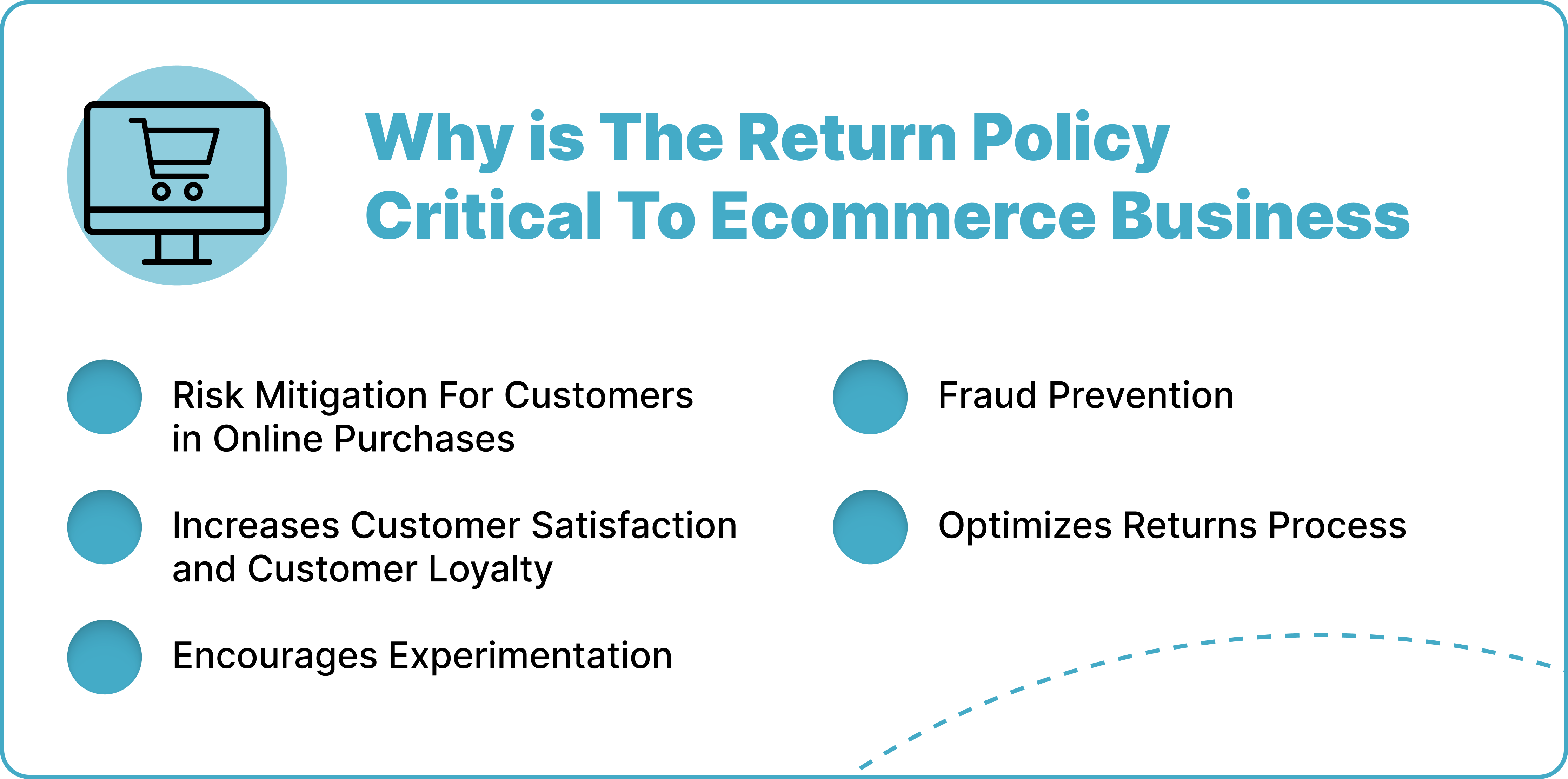
Transparent Shipping Costs and Hassle-Free ReturnsSurprise costs are the single biggest reason carts get abandoned
Wishlists and Loyalty ProgramsRepeat buyers are cheaper to sell to than new ones
Regional Language and Hyperlocal PersonalizationIndia’s next wave of shoppers won’t buy from an English-only store
AccessibilityA meaningful share of shoppers leave sites they can’t navigate
Continuous Testing and AnalyticsEvery feature on this list is a hypothesis until you test it on your own traffic

A Few Numbers Worth Knowing Before You Scroll Further, All Pulled From The Sources Cited Later In This Guide:

  • Checkout friction and surprise costs cause the majority of abandoned carts, not weak products (see #11 and #12).
  • A 0.1-second improvement in mobile load time lifted retail conversions by 8.4% in joint research from Google and Deloitte (see #10).
  • Positive reviews lift conversion by up to 133%, according to BigCommerce (see #7).
  • Roughly 540 million Indians shop primarily in a regional language, not English (see #14).
  • Retailers running AI recommendation engines report revenue gains as high as 30% (see #6).
Where These Features Sit In The Shopper’s Journey:
Discovery → Landing & Navigation → Product Page → Cart → Checkout → Purchase → Repeat Purchase

Mapped against the funnel, here’s which features are pulling weight at each stage:

Funnel StageFeatures Doing The Work
Discovery & Landing#1 Navigation & Search, #2 Mobile Design, #15 Accessibility
Product Page#3 Product Pages, #6 AI Recommendations, #14 Regional Language
Decision#4 CTAs, #7 Reviews & Social Proof, #9 Customer Support
Cart & Checkout#5 Payments, #11 Checkout, #12 Shipping Transparency
Post-Purchase#8 Inventory & Restock Alerts, #13 Wishlist & Loyalty, #16 Testing & Analytics

A store rarely fails because of one broken feature. It fails because one stage of this funnel is quietly leaking shoppers while every other stage looks fine on paper. Use the map above to figure out which stage of your own funnel needs attention before you read the full breakdown below.

Mapped against the funnel, here's which features are pulling weight at each stage

16 Most Important eCommerce Website Features That Drive Conversions For The Indian Market

The sixteen features below aren’t isolated design choices. Each one also feeds directly into ecommerce SEO, user satisfaction, and how much a shopper trusts your brand before they check out. Here’s the breakdown, one feature at a time.

1. Intuitive Navigation And Smart Search

Intuitive navigation is one of the eCommerce website features that drives conversion on eCommerce platforms. Good navigation that includes a clear taxonomy for category pages and an easily understandable menu is foundational eCommerce UX. It helps searchers find products on the platform before anything else on the page gets a chance to work.

According to Shopify, 91% of eCommerce platforms fail to implement features like highlighting in the main menu to help identify the current scope of a user. This feature helps orient users and keeps them engaged.

Take the following foolproof navigation features into account when developing your eCommerce website to make the shopping experience better on your platform:

  • Intermediary category pages
  • Homepage carousels
  • Smooth navigation cursors

One piece of navigation that’s easy to overlook is faceted filtering. A shopper who lands on a category page with 400 products and no way to narrow by size, price band, or brand. Or delivery speed will leave before they scroll past the first row. This matters even more on high-SKU catalogues and B2B storefronts. Where a buyer often knows exactly what spec they need and just wants the fastest route to it.

Build your filters so each combination gets its own indexable URL rather than a JavaScript state that resets on refresh. Done right, this turns “blue running shoes under ₹2000” into a real landing page instead of a dead end. Which helps both the shopper and your organic search visibility.

2. Mobile-First And Responsive Design

We need not spend long on why this matters; both traffic attraction and client retention depend on responsive design. And it’s one of the eCommerce website features that pays off across every other section on this list.

According to NumberAnalytics.com, websites with mobile-focused eCommerce design tend to perform 102% better.

When an eCommerce website is optimized for mobile searchers and is mobile-friendly. It’s bound to improve on-page sessions and reduce bounce rates, two critical aspects of eCommerce SEO.

Here Are Some Tips To Include In Your Mobile-first Responsive Design:

  • Start the design with a mobile-first approach.
  • Simplify navigation with a collapsible menu and high background contrast.
  • Use finger-friendly buttons.
  • Build a grid system that adjusts to different screen sizes.
  • Implement media queries for adjusting layouts and content according to screen size.
  • Add a sticky “Add to Cart” button on product pages.

Here’s how shifting to a responsive eCommerce website design helped big-name brands in the eCommerce ecosystem:

BrandWhat They Get Right
AmazonSets the standard for mobile-friendly design with a flexible grid system that adjusts to any screen size
ZaraSeamless navigation built around large, high-quality images that resize dramatically without losing clarity
AppleA long-standing minimalist UI standard, carried through to its eCommerce site via accessibility, usability, and a smooth overall experience

If your current platform can’t support these standards without a significant rebuild, that’s a conversation worth having early. Ecommerce website development done reactively. After traffic has already grown past what the platform can handle. Always costs more than the same fix made on schedule with an experienced eCommerce development agency.

3. High Quality Product Pages

High-quality product pages aren’t just among the best eCommerce website features that drive conversions; they are a necessity. According to NumberAnalytics.com, quality images, especially product images with 360-degree views, ensure 40% more conversions.

In 2022, Nielsen Norman Group confirmed in a study that better visuals on an eCommerce platform can ensure 14.8% longer on-page sessions.

Think of your eCommerce platform as a virtual shop, and your audience is there to both purchase and leave with a worthwhile experience. Build your product pages around what your customers actually need to see before they trust a purchase decision.

Video deserves a callout of its own here, separate from static photography. A 20-30 second clip showing scale, texture, or the product in use answers questions a photo can’t. How a fabric drapes, how loud an appliance runs, how a shade looks outside studio lighting.

Product pages with video consistently outperform image-only pages on time spent and add-to-cart rate. For categories like apparel, electronics, and home goods, video quietly does something equally valuable. It lowers returns, because the buyer’s expectations are set correctly before checkout instead of being corrected after the box arrives.

4. Prominent, Conversion-Ready CTAs

A product page can get everything else right and still lose the sale at the one moment that matters. The click. Call-to-action buttons carry more weight than their size suggests. Because they’re the single point where interest turns into action or gets abandoned.

The buttons that convert share a few traits. They contrast sharply against the page background instead of blending into a brand’s muted colour palette. They sit close to the product details and price, not buried below a long description the shopper has to scroll past. And their copy stays plain. “Add to Cart” and “Buy Now” consistently outperform clever alternatives, because a hesitant shopper doesn’t want to decode what a button means.

On longer pages, particularly detailed product listings or comparison pages. Repeat the primary CTA at intervals rather than placing it once at the top. A shopper who scrolls to read specs, reviews, and shipping details shouldn’t have to scroll back up to act on a decision they’ve already made.

One detail worth testing separately on Indian traffic: what performs best on desktop rarely performs best on mobile. Where thumb reach and one-handed use change which screen position actually gets tapped.

5. Secure Payment Gateways And Multiple Payment Options

Popular Indian UPI payment solution PhonePe revealed in a statistic that a payment success rate of 98% or higher significantly boosts customer satisfaction. It’s needless to say that increasing customer retention also improves the number of repeat clients.

A successful eCommerce store that wants to thrive must see beyond selling. Every point of contact between the platform and the customer needs to be made easier. And payment is one of the eCommerce website features where trust gets tested hardest.

Indian eCommerce Platforms Should Offer Multiple Payment Options, Including:

  • UPI
  • Credit/debit card payment
  • BNPL
  • Wallet
  • Pay on Delivery

Ensure that the payment gateways provided rely on SSL and TLS encryption to secure user data.

Encryption protects the transaction, but it does nothing for a shopper’s confidence unless they can actually see it working. Place recognizable trust marks near the payment button itself, not just tucked into the footer. A padlock icon, the logos of the UPI apps and cards you accept. And a short line confirming your returns or buyer-protection policy.

A first-time visitor decides whether to trust a checkout screen in the couple of seconds it takes to glance at it. A cluttered or unfamiliar-looking payment page is often the real reason a sale drops off at the last step. Even when the gateway underneath is working exactly as it should.

6. AI-Driven Recommendations For eCommerce

If you’re a regular Amazon shopper, you’ve seen this notification on the platform: “Customers who bought this item also bought…” That’s AI’s recommendation at work. From eCommerce retailers like Amazon to entertainment platforms like Netflix and Spotify. This kind of personalization has become standard infrastructure, not a novelty feature.

A McKinsey Global Survey in 2022 revealed that retailers using AI recommendations on eCommerce are likely to see a 19% surge in revenue. This gets more interesting when the recommendation feature shapes itself into a full product recommendation engine, leading to a 15-30% revenue increase.

Recommendation engines are the most visible form of personalization, but building one that improves margin rather than just adding noise is an AI automation problem, not a plugin you switch on and forget.

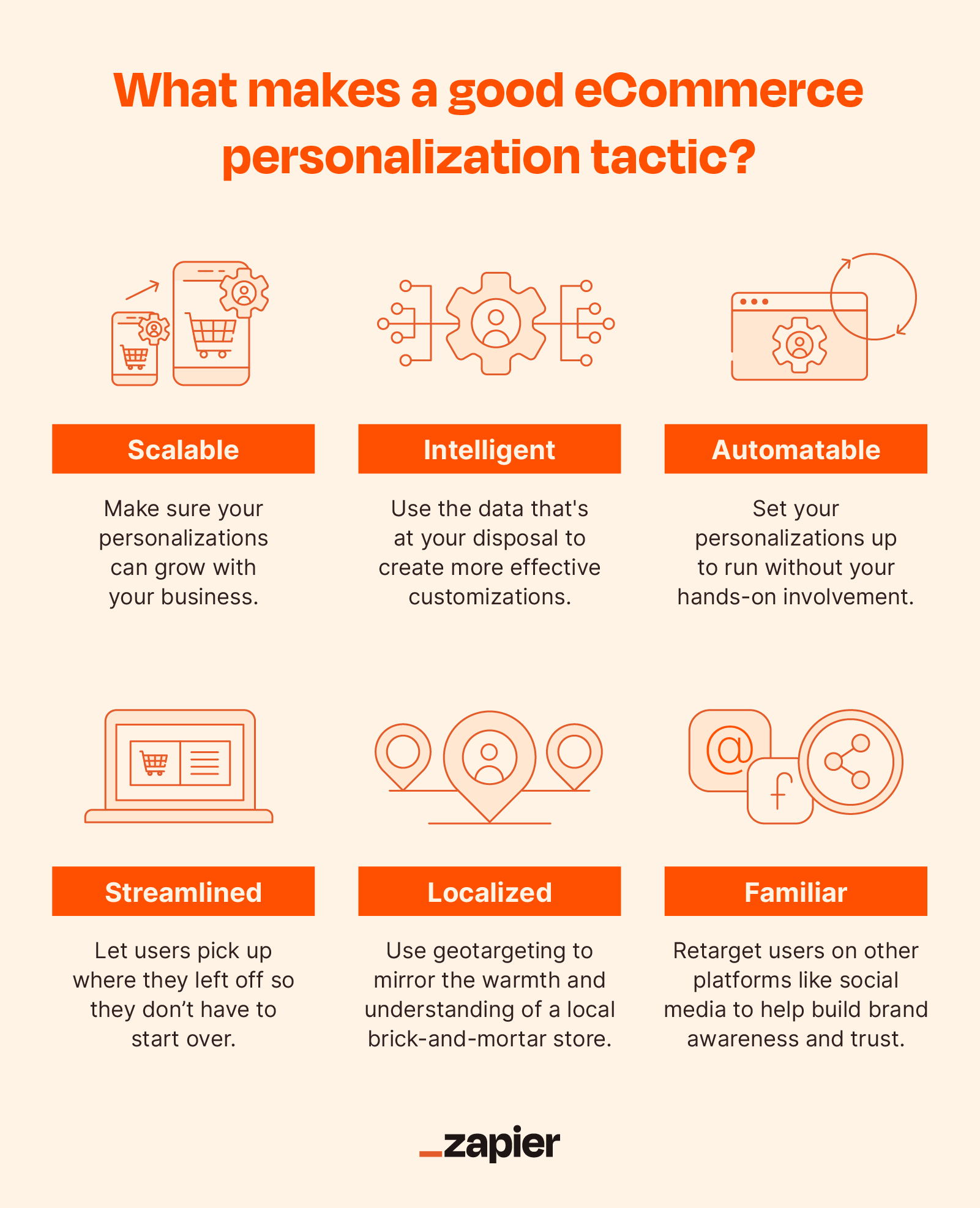
Recommendations aren’t the only personalization layer worth building. Geo-targeting that automatically surfaces regional offers, realistic delivery estimates. And a default language based on where the visitor is browsing from removes friction before they’ve even started looking at products.

Segmenting returning visitors from first-time ones is a smaller lift than a full recommendation engine. And usually the first personalization feature worth shipping. Show a returning shopper their recently viewed items instead of the same generic homepage everyone else sees. And the site already feels like it remembers them.

7. Social Proof And Reviews

Sales increase when eCommerce websites lean into social proof and reviews. A BigCommerce study outlines that conversion increases by 133% when users see positive reviews about a product on an eCommerce platform.

The same research suggests that 82% of Americans check recommendations from a friend when making a purchase. Buyers checking reviews and user-generated content before considering a product is common behaviour well beyond that one market too.

eCommerce owners must start collecting user reviews and showcase them on the platform to build transparent social proof.

Beyond Reviews Themselves, Consider:

  • Testimonials
  • User-generated content
  • Sales numbers
  • Expert endorsements across your website and social channels

Skipping social proof is one of the more expensive gaps to leave open on any eCommerce website features checklist. It also ties directly into how search engines evaluate trust; reviews and testimonials feed several of the SEO ranking factors Google weighs when deciding whether to trust a product page at all.

8. Real-Time Inventory And Order Management

Even platforms with every other feature on this list right can fail here. According to Firework, 69% of online shoppers would abandon their purchase when they see a product out of stock. And stockouts are responsible for an estimated $1 trillion worth of global sales lost each year.

Small eCommerce platforms often respond by overstocking, which trades one problem for another: inefficient operations and cash flow strain. The better fix is one of the more overlooked online store features: a real-time inventory and order management workflow that keeps the platform accurate for shoppers without forcing you to guess at safety stock.

Where inventory does run out, give the shopper a reason to come back instead of walking away for good. A simple “notify me when back in stock” capture triggered by email, SMS, or WhatsApp turns a lost sale into a queued one. It doubles as a free demand signal, telling you exactly which SKUs to prioritise in your next restock instead of guessing from last quarter’s sales report.

9. Customer Support Integration

According to Lumina Datamatics, 75% of customers are willing to spend more on platforms that offer better customer service. Successful eCommerce platforms are built on reliable customer service; it’s one of the eCommerce website features that compounds. A support team that solves problems fast turns a complaint into a reason to buy again.

Give Users Different Ways To Raise Grievances, Ask Questions, And Leave Feedback:

  • Chat support through text
  • Email support
  • Mobile phone call support

One channel is worth separating out: proactive live chat, which is different from a ticket queue the customer has to go find and open. A chat widget that opens with a relevant nudge, say, after twenty seconds spent hovering over a size chart, catches hesitation before it turns into an exit.

In the Indian market specifically, a WhatsApp Business integration tends to outperform a standard web chat widget for one simple reason. Shoppers already have the app open, and they trust it more than typing into an unfamiliar box on an unfamiliar site.

10. Page Speed And Core Web Vitals

None of the features above matter if the page hasn’t finished loading. This is the biggest blind spot on most “conversion feature” checklists, and it’s a strange one to miss, because the data on it is unusually consistent.

A joint study by Google and Deloitte found that a 0.1-second improvement in mobile load time lifted retail conversions by 8.4% and average order value by 9.2%. Run that logic the other way, and the pattern holds: independent analyses commonly put the cost of a single extra second of mobile load time at around 7% of conversions a real, recurring line item of lost sales for any store doing meaningful monthly revenue.

Google’s Core Web Vitals give you the specific targets to build toward: Largest Contentful Paint under 2.5 seconds, Interaction to Next Paint under 200 milliseconds, and Cumulative Layout Shift under 0.1. These have been search ranking signals since 2021, so fixing speed helps twice: once at the point of ranking, again at the point of purchase. For the full breakdown, see our guide to Core Web Vitals and ranking factors.

This matters more in India than in most markets, not less. A large share of Indian shoppers browse on mid-range Android devices over inconsistent 4G, particularly outside the metros, the same tier-2 and tier-3 towns driving most of the country’s new online shopper growth. A site that feels merely “a bit slow” on a Delhi office wifi connection can be borderline unusable on a patchy connection in Coimbatore or Indore.

Compress and lazy-load images, and defer anything not needed for the first paint. Keep an eye on how many third-party marketing scripts and tracking pixels have quietly stacked up on the page. And test on an actual mid-range device, not just a fast laptop on office broadband.

11. Frictionless Checkout And Cart Recovery

Cart abandonment averages just over 70% across eCommerce globally. Baymard Institute’s checkout research points to a short list of preventable causes: unexpected extra costs, forced account creation. And a checkout that takes too long. Forced account creation alone accounts for roughly a quarter of abandonments. Guest checkout isn’t a nice-to-have; it’s one of the highest-leverage shopping cart features a store can ship. And the fix here is specific and testable rather than vague.

The average eCommerce checkout asks for around 23 form fields. A well-optimised one gets that down to 12-14 without losing information the order needs. Address autofill, saved UPI IDs and cards for returning customers, and a visible progress indicator. And a sticky order summary all chip away at the same problem; every extra field is one more moment to reconsider. For India specifically, OTP-based mobile login beats an email-and-password flow. And pincode-based address auto-fill saves a genuinely painful amount of typing on a phone keyboard.

Checkout friction is only half the story; the other half is what happens after someone leaves anyway. A structured recovery sequence: a nudge within the hour, a follow-up the next day. Maybe a small incentive on the third touch recovers a meaningful share of abandoned carts that would otherwise be gone for good. This is squarely conversion rate optimization territory: testing checkout variants against a control rather than guessing which field to cut.

Email is the default recovery channel, but for the Indian market, WhatsApp often outperforms it; open rates run dramatically higher for mobile-first shoppers, and a well-timed nudge with the exact cart contents feels far less like spam than another promotional email. Of all the eCommerce website features on this list, checkout is the one where a small fix tends to show up in revenue fastest.

12. Transparent Shipping Costs And Hassle-Free Returns

Extra costs showing up unannounced at the final step are, by a wide margin, the single most common reason shoppers abandon a cart. This shows up across nearly every independent study on the subject, usually in the range of roughly half of all abandonments. The fix isn’t complicated: show a shipping estimate on the product page or cart, not just at the final checkout screen. An “add ₹X more for free delivery” nudge reduces abandonment and quietly lifts average order value at the same time.

This deserves specific attention in the Indian context. Cash-on-delivery orders often carry a convenience fee that catches first-time buyers off guard, and return logistics for COD orders arranging a reverse pickup are a genuine pain point outside the metro courier networks. Be explicit about who pays for a return, how many days the window lasts, and whether a COD return comes back as store credit or a bank refund, since not every shopper has a linked account they fully trust for online transfers.

One more India-specific detail worth getting right: show the final, tax-inclusive price up front. Indian shoppers are used to MRP meaning the price they actually pay, and a checkout that adds GST as a surprise line item at the end reads as a trust problem, not just a pricing one. A dedicated, easy-to-find returns policy page linked from the product page itself, not buried three clicks deep in the terms and conditions, closes the loop.

13. Wishlists And Loyalty Programs

The average eCommerce store converts roughly 28% of first-time buyers into repeat customers, and repeat customers consistently spend more per visit than someone buying for the first time. Two eCommerce website features do more than most to move that number: wishlists and loyalty programs.

A wishlist or “save for later” option matters because a large share of the people leaving without buying weren’t lost sales to begin with; they were browsing, comparing, or waiting for payday. Giving them a way to bookmark intent, and a gentle nudge later when that saved item goes on sale or is running low on stock, converts a browsing session today into a purchase next week instead of losing it entirely.

Loyalty programs earn their keep specifically through redemption. Members who actually redeem their points show repeat-purchase rates roughly five times higher than members who never do. The program only works once people use it, so keep the mechanics visible and the redemption process short.

In India, a cashback-style reward, credited straight to a wallet balance usable on the next order, tends to outperform a generic points system, mostly because it mirrors the cashback mental model shoppers already have from UPI apps and quick-commerce platforms. It doesn’t need to be elaborate; a simple three-tier structure with a couple of real perks, like early access or a lower free-shipping threshold, beats no program at all.

14. Regional Language And Hyperlocal Personalization For India

This is arguably the biggest gap on this list relative to how the Indian market actually behaves.

Roughly 73% of India’s internet users engage primarily in Indian languages, representing a regional-language base of around 540 million people. Most eCommerce sites built for India, even ones that get everything else right, still run English-only or offer a toggle that translates only the menu and buttons while product descriptions, size guides, and support scripts stay in English. That’s a half-measure, and shoppers notice.

It matters most for the audience driving India’s next growth phase: roughly 60% of new online shoppers now come from tier-2 and tier-3 cities, not the metros. These buyers tend to have tighter data budgets, shop on patchier connections, and trust a site that greets them in a familiar language with recognisable payment icons.

Features Worth Prioritising:

  • A language switcher that changes product content, not just navigation labels.
  • Pincode-based serviceability checks before a shopper fills out a full form.
  • A lightweight “lite” mode for lower-end Android devices.
  • Regional-language voice search readiness: shoppers already ask Google Assistant or Alexa for products in Hindi, Tamil, or Bengali, and an English-only catalogue is invisible to that query pattern.
  • A WhatsApp Business catalogue, which increasingly acts as a genuine parallel storefront and feels less intimidating than a full website for first-time online shoppers.

Voice and AI-assistant queries are becoming a distinct discovery channel in their own right, worth treating as part of a dedicated AI search optimization strategy rather than an afterthought bolted onto standard SEO.

15. Accessibility: Designing For Every Shopper

Accessibility rarely makes it onto “conversion feature” lists, which is odd, because the data behind it is more concrete than most of the eCommerce website features that do make the list. Roughly 69-70% of shoppers with disabilities say they click away from a website they find difficult to navigate, and a large share limit their online shopping entirely to sites they already know are accessible, meaning an inaccessible site doesn’t just lose a single visit; it loses that customer’s future business too.

India’s own guidelines for government websites (GIGW) already reference WCAG conformance, and the general direction in India and globally is toward treating this as a baseline expectation rather than an edge case.

The starting checklist isn’t complicated: proper, descriptive alt text on product images instead of a filename; sufficient colour contrast on price text and “Add to Cart” buttons; a checkout that can be completed with a keyboard alone; form fields with labels that stay visible instead of placeholder text that vanishes the moment someone starts typing; and captions on any video content.

The useful reframe here: most accessibility fixes are just eCommerce UX fixes that happen to help everyone. Larger tap targets help someone with a cracked phone screen as much as they help a user with limited mobility. Clear, persistent form labels help a shopper filling out an address one-handed on a crowded train just as much as they help a screen-reader user. For a deeper look at how these choices affect engagement beyond accessibility alone, see our website user experience guide.

16. Continuous Testing And Analytics: Building A CRO Culture

Every feature on this list is a hypothesis, not a guarantee. What lifts conversions for a fashion D2C brand in Mumbai might do nothing for a B2B electronics distributor in Pune; the only way to know for certain is to test it against your own traffic and your own baseline.

Baymard Institute’s checkout research is a useful reminder here: even after a decade of large-scale testing across major global retailers, the average large eCommerce site still carries dozens of documented, fixable usability issues. No site “graduates” from testing, however mature the brand.

In practice, this means a few habits, not a big annual project: session replay and heatmap tools to see where shoppers actually hesitate, rather than where you assume they do; a funnel view of product page → cart → checkout → purchase. So you can see exactly which stage is bleeding orders instead of optimising blindly. And a light quarterly review rather than one exhausting yearly redesign.

Resist the pull of vanity metrics time-on-site and pageviews feel good on a dashboard, but the number that actually pays the bills is completed orders per 100 visitors. Keep that one number visible to the whole team, and treat every feature above, including the recommendation engine in Section 6, as something to validate against a control group, not roll out and assume worked.

If you’re not sure where your own site currently stands against this list, a free eCommerce audit is a faster starting point than guessing which of these sixteen to prioritise first.

How Leading Indian And Global Brands Put These Features To Work

It’s one thing to list sixteen features. It’s another to see how brands your customers already trust actually apply them. A few examples worth studying:

Flipkart builds its entire growth strategy around #14 (regional language) and #13 (loyalty). Product listings, checkout, and support run in Hindi and several other Indian languages, not just the navigation menu, and the free-to-join Flipkart Plus program rewards SuperCoins on every order that shoppers can redeem for discounts and partner perks. The platform has also pushed further into voice search and short-video product discovery, a direct bet on shoppers in smaller towns who don’t type long search queries.

Nykaa leans hardest on #3 (product pages) and #6 (recommendations). Its Nykaa TV video library and the Nykaa Network community turn product research into something closer to editorial content than a spec sheet, and the homepage personalises around skin type, past purchases, and browsing history. That combination of video, community, and personalisation is a large part of why the brand converts as well as it does in a category where shoppers can’t touch or smell the product before buying.

Myntra is a case study in #3 and #6 working together at scale. Detailed size charts and a try-and-buy option address the single biggest hesitation in fashion ecommerce, fit, while AI-driven recommendations and AR try-on tools personalise the browsing experience further. Its M-Live shoppable video format takes recommendation logic one step further by putting a real host in front of the product in real time.

None of these platforms invented a new feature. They just executed the fundamentals on this list with more discipline than most, and it shows up directly in their conversion numbers.

Common eCommerce Website Mistakes That Undo These Features

You can get most of this list right and still lose sales if a handful of avoidable mistakes are sitting quietly on your site. Most of these aren’t exotic. They’re the same handful of errors showing up across store after store.

Common eCommerce Website Mistakes That Undo These Features
  • Treating Mobile As An Afterthought: Testing on a laptop and assuming mobile “looks fine” quietly breaks #1, #2, and #4 all at once.
  • Hiding Shipping Costs Until The Final Screen: This alone undoes the trust #12 is supposed to build, and it’s still the single most common reason a cart gets abandoned.
  • Forcing Account Creation Before Checkout: A single extra step that erases a meaningful share of the work #11 is trying to do.
  • Shipping A Product Page With One Low-resolution Photo: Section #3 exists because visuals carry the weight a salesperson would in a physical store; a thin gallery leaves that job undone.
  • Ignoring Page Speed Until Traffic Has Already Dropped: By the time a slow site shows up in your analytics, #10 has already been costing you money for months.
  • Launching With Zero Reviews, Or Hiding The Negative Ones: A product with no reviews reads as untested to a new visitor, undercutting everything #7 is meant to fix.
  • Stuffing Checkout With 20-plus Form Fields: Every field beyond what the order truly needs works directly against #11.
  • Writing CTA Copy Like “Submit” or “Proceed “: Vague, generic buttons quietly undercut #4, even when the design around them is excellent.
  • Leaving Payment Pages Unbranded And Unfamiliar-looking: No visible trust marks near the button undoes the confidence #5 is meant to build, no matter how strong the encryption underneath actually is.
  • Running An English-only Store For An India-wide Audience: This is the fastest way to lose the tier-2 and tier-3 growth #14 is built around.
  • Shipping Tables And Menus That Break On Smaller Screens: A layout that “mostly works” on mobile still fails the shoppers #2 and #15 exist to serve.

Most of these show up during a routine audit, not a redesign. Our breakdown of website design mistakes that quietly kill conversions and common conversion rate optimization mistakes go deeper into how to catch each one before it costs you real revenue.

Which Features To Build First: A Priority Matrix By Business Stage

Not every store needs all sixteen features on day one. Building in the wrong order is its own kind of waste; spending on personalisation while your checkout is still leaking orders solves nothing. Here’s a rough sequencing guide based on where a business typically stands:

Business StageBuild FirstAdd NextWorth Investing In Later
Startup / Pre-Product-Market-Fit#1 Navigation & Search, #2 Mobile Design, #4 CTAs, #5 Payments, #10 Page Speed, #11 Guest Checkout#7 Reviews, #9 Customer Support#6 AI Recommendations, #13 Loyalty
Growing Store (Repeat Traffic, Scaling Ad Spend)#6 AI Recommendations, #8 Inventory Management, #9 WhatsApp/Live Support, #11 Cart Recovery#13 Wishlist & Loyalty, #14 Regional Language#15 Accessibility Audit, #16 CRO Program
Enterprise / Multi-Region / High SKU Count#8 Real-Time Multi-Warehouse Inventory, #14 Full Regional-Language Commerce, #15 Accessibility Compliance#16 Structured CRO Testing ProgramHeadless architecture, advanced personalisation at scale

If you’re a startup, resist the urge to build a recommendation engine before your checkout can hold up under real traffic. If you’re already scaling, the opposite mistake is more common: polishing a mobile design that’s already solid instead of fixing the inventory or support gaps that are actually costing repeat orders.

What These Features Typically Cost To Build

This is one of the most common questions we get asked, and one of the least answered honestly online. Costs vary by platform, catalogue size, and how much is custom-built versus plugin-based, but here’s a realistic planning range for the Indian market:

FeatureTypical Indicative Range (INR)
Guest checkout & checkout optimisation₹15,000 – ₹60,000 one-time, or bundled into platform theme/dev cost
Live chat / WhatsApp Business integrationFree – ₹15,000/month depending on volume and automation
AI-powered search & recommendations₹8,000 – ₹40,000/month depending on catalogue size and tool
Loyalty & rewards program₹5,000 – ₹25,000/month for app-based tools; ₹50,000+ one-time for a custom build
Reviews & UGC collection toolsFree – ₹8,000/month
Regional language layer (multi-language catalogue)₹40,000 – ₹2,00,000+ one-time, scaling with catalogue depth and number of languages
Page speed / Core Web Vitals audit and fix₹20,000 – ₹1,50,000 one-time, depending on site complexity

Treat these as planning ranges, not quotes; get them confirmed against your specific platform and catalogue before budgeting. Platform choice moves these numbers more than almost anything else; our Shopify vs WooCommerce vs Magento comparison is a useful starting point if you haven’t locked that decision in yet, and our ecommerce website development cost guide breaks down full-build costs in more detail.

Essential vs Advanced: What To Build Now vs Later

A useful way to think about this list is in two tiers: the baseline every store needs, and the upgrade path once you have the traffic and data to justify it.

Essential (Baseline)Advanced (Scale-Stage Upgrade)
Keyword-based searchAI-powered semantic search with filters
Static navigation menuBehaviour-based, personalised navigation
Manual page speed fixesContinuous Core Web Vitals monitoring
Standard multi-step checkoutOne-click checkout with saved payment methods
Email order updatesWhatsApp + SMS + email order journey
Star-rating reviewsVideo reviews and UGC galleries
Generic “you may also like”Real-time, behaviour-driven AI recommendations
Points-based loyaltyTiered loyalty with redemption-optimised rewards
Manual inventory trackingReal-time, multi-warehouse inventory sync
Basic language toggleFull regional-language commerce experience

There’s no shame in running the “Essential” column for the first year or two of a store’s life. The mistake is assuming the “Advanced” column is optional forever once repeat-purchase volume starts justifying the investment.

Quick Self-Audit: Does Your eCommerce Website Have What It Needs?

Before you plan any new build, it’s worth scoring what you already have. Run through this checklist honestly:

  • ✅ Mobile-first, responsive design
  • ✅ Page speed within Core Web Vitals thresholds
  • ✅ Faceted, filterable product search
  • ✅ Product pages with multiple images and video
  • ✅ Clear, high-contrast CTAs repeated on long pages
  • ✅ SSL/TLS encryption with visible trust marks near payment
  • ✅ Multiple payment options, including UPI and COD
  • ✅ AI-driven or behaviour-based recommendations
  • ✅ Visible product reviews and UGC
  • ✅ Real-time inventory with “notify me” for out-of-stock items
  • ✅ Live chat or WhatsApp support integration
  • ✅ Guest checkout with 12-14 form fields or fewer
  • ✅ Transparent, tax-inclusive shipping costs shown early
  • ✅ Wishlist and a loyalty or rewards program
  • ✅ Regional language support beyond the navigation menu
  • ✅ Accessible design (alt text, contrast, keyboard navigation)
  • ✅ Ongoing CRO testing and analytics in place

A faster gut-check, five questions worth asking honestly:

QuestionYesNo
Does your site load in under 2.5 seconds on a mid-range mobile device?
Can a shopper check out without creating an account?
Are your shipping costs visible before the final checkout screen?
Do your product pages include reviews and video, not just photos?
Does your site serve a genuinely usable experience in a regional Indian language?

If you answered “No” to two or more of those five, that’s usually where to start, before adding anything new. If you’d rather have this scored properly against your own traffic instead of self-rating it, our free eCommerce audit does exactly that.

Frequently Asked Questions:

Q1. What’s The Single Highest-impact eCommerce Feature For Conversions?

A: There’s no universal answer, but two factors show up as the biggest levers across nearly every independent study: page speed and checkout friction. A slow, complicated checkout undermines every other item on this list of eCommerce website features, since a shopper who never finishes loading the page, or gives up mid-checkout, never sees your product pages, reviews, or recommendations in the first place.

Q2. How Many Form Fields Should An Indian eCommerce Checkout Have?

A: Baymard Institute’s benchmark puts the average eCommerce checkout at around 23 form fields, while a well-optimised one gets by on 12-14. For the Indian market, OTP-based mobile login and pincode-based address autofill typically cut this further without losing any information the order actually needs.

Q3. Do Indian Shoppers Really Abandon Carts Over Shipping Costs?

A: Yes. Unexpected extra costs at checkout shipping, taxes, COD convenience fees are consistently the top reason for cart abandonment in studies worldwide, and India adds its own wrinkle through COD fees and reverse-pickup friction on returns. Showing the final, tax-inclusive cost early in the journey addresses this directly.

Q4. Is A Native Mobile App Necessary, Or Is A Responsive Website Enough?

A: For most D2C and SMB brands in India, a fast, well-built responsive website covers the large majority of the case. A native app becomes worth the extra engineering and maintenance cost once repeat-purchase volume justifies it; until then, an app download is itself a point of friction for a first-time online shopper who’s cautious about phone storage and data usage.

Q5. How Often Should These Features Be Reviewed Or Updated?

A: Treat it as a light quarterly check rather than a once-a-year overhaul: watch session recordings, review your funnel drop-off points, and prioritise fixes based on where you’re actually losing orders. Save the deeper audit for once or twice a year, or whenever you make a significant change to your catalogue or platform.

Q6. Does Adding All Sixteen Of These Features Guarantee Higher Conversions?

A: No, these features create the conditions for conversion, they don’t guarantee it on their own. A feature that worked well for a competitor, or even for another brand in your own category, might do nothing for your specific audience without being tested against your own baseline. Treat this list as a starting checklist, not a finished one.

Q7. Which Features Should A Small Business Or New D2C Brand Prioritise First?

A: Start with the fundamentals that every later feature depends on: mobile-first design, fast page load, clear CTAs, secure payments, and a guest checkout that doesn’t ask for more than the order needs. Recommendation engines and loyalty programs matter, but they compound the returns from a checkout that already converts; they don’t fix one that doesn’t.

Q8. How Many Payment Gateways Should An Indian eCommerce Store Offer?

A: Most Indian stores do well offering three to five options: UPI, at least one card processor, a wallet option, and Pay on Delivery for categories or regions where trust in online payment is still building. Offering every gateway on the market adds page clutter without adding meaningful conversion once the core options are covered.

Q9. Is Guest Checkout Really Necessary, Or Can A Store Require Account Creation?

A: It’s necessary. Forced account creation is one of the most consistently documented causes of cart abandonment, accounting for roughly a quarter of it in Baymard Institute’s research. A better approach is offering account creation as an option after the purchase completes, once the shopper has already committed.

Q10. What Does It Typically Cost To Add These Features To An Existing Store?

A: It depends heavily on your platform and how much is custom versus plugin-based, but most individual features land somewhere between a few thousand rupees a month for tool-based additions and a low six-figure one-time cost for deeper, custom builds like a full regional-language layer. See the cost breakdown earlier in this guide, or our full ecommerce website development cost guide, for specifics by feature.

How Viacon Helps Indian Brands Build High-Converting eCommerce Websites

Most of this list is fixable without a full platform rebuild, but it does take a team that’s diagnosed these same sixteen issues across enough different stores to know which one is actually costing you the most.

That’s the work we do day to day: UX and CRO audits that isolate exactly where a funnel is leaking, eCommerce development across Shopify, WooCommerce, and Magento builds, page speed and Core Web Vitals fixes, and the SEO work that makes sure the pages you’ve optimised for conversion are also the ones showing up in search. For stores that need something more custom than a theme can offer, our custom web development team builds it from the ground up instead of forcing a platform limitation into a workaround.

Across the audits and builds we’ve run, five fixes come up more often than any other when a store’s conversion rate is underperforming its traffic:

  1. A mobile-first redesign, not a retrofit of a desktop layout
  2. Simplifying checkout down to what the order actually needs
  3. Fixing page speed before adding any new feature
  4. Better product imagery and video, especially on categories with high return rates
  5. Search and filtering that actually matches how shoppers browse, not just how the catalogue is organised

None of these is exotic. They’re just the ones that get skipped in favour of flashier features, and they’re usually the first five things worth fixing before anything else on this list.

Keep Refining Your eCommerce Platform

eCommerce features evolve, and with new tools coming out, it’s essential to stay on track as an eCommerce business. The sixteen features above cover the ground most Indian eCommerce businesses miss somewhere between launch and scale, from the technical like page speed and accessibility, to the deeply market-specific, like regional language support and COD-friendly returns.

Even if you missed some of these when you first built your platform, most can be retrofitted through focused eCommerce website development rather than a full rebuild. Pull from your own analytics before adding anything new; session recordings and funnel data will tell you which of these sixteen matters most for your specific catalogue and audience, rather than guessing from a list, including this one.

Treat this eCommerce website features list as the starting audit, and lean on ongoing conversion rate optimization to tell you which fix to prioritise first. If you’d rather have a second set of eyes than retrofit alone, talk to our eCommerce team about which of these sixteen would move your numbers fastest.

author-img

Mainak Bhattacharya is an SEO content specialist with 5+ years of experience crafting performance-driven content across fintech, tech, and hospitality sectors. His work focuses on search intent alignment, content strategy, and building long-term organic visibility and digital authority for brands. With professional training in digital marketing, PR, and advertising, he blends clarity, structure, and strategy to produce content that builds authority in competitive digital spaces.

View all posts

Related blogs

Local SEO For Law Firms: Dominate The Google Map Pack In Your City
Aug 2026

Local SEO For Law Firms: Dominate The Google Map Pack In Your City

11 Best Digital Marketing Practices For 2026: What Really Works & What Doesn’t? 
Aug 2026

11 Best Digital Marketing Practices For 2026: What Really Works & What Doesn’t? 

Content Marketing Strategies Built Around Trust, Not Traffic
Aug 2026

Content Marketing Strategies Built Around Trust, Not Traffic

Tools

Try Our Free Tools

Try our free tools to explore powerful features, improve efficiency, and experience real results with no cost, no commitment, and an easy, user-friendly setup.

dot-img

ROAS Calculator

Use our free ROAS Calculator to instantly measure return on ad spend, optimize campaigns, and make smarter marketing decisions with clear, accurate insights.

dot-img

Audit Reports

Access our Audit Reports to identify performance gaps, uncover opportunities, and gain clear insights that help improve efficiency, compliance, and overall business growth.

dot-img

SEO Checker

Use our SEO Checker to analyze your website, find technical and content issues, and get actionable insights to improve rankings, traffic, and overall search visibility.